Overview
SystemOn is a Shure conferencing audio asset management software designed for audio/IT professionals. This project involves refreshing the old UI based on company design system, as well as fixing some user experience issues. It ran in Agile.
Team: Collaborated with global cross function teams located in North America and Europe, including engineering, testing, marketing, research, etc. Team size is 50+.
Product Launch: 2020
Contribution: User experience design, Interaction design, Prototyping, User research
Before & After
Project Summary
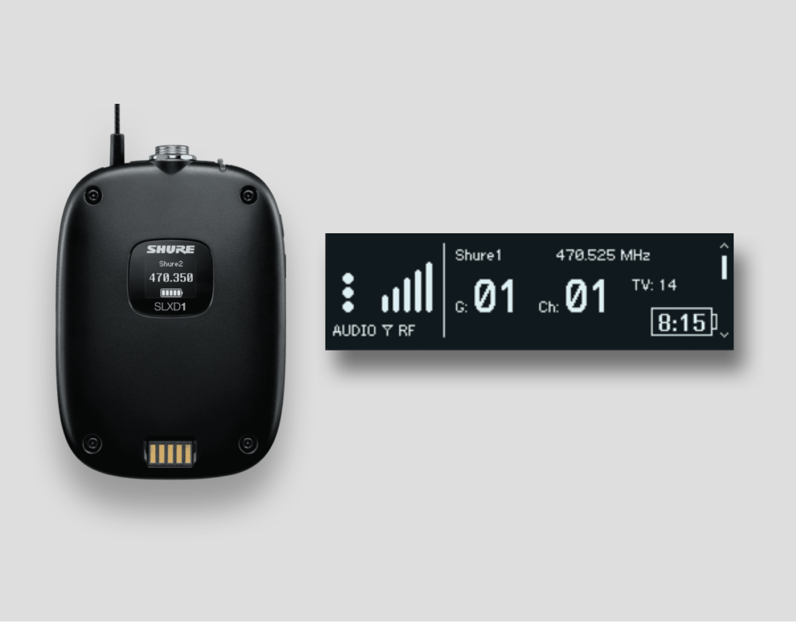
Urgent Need: This enterprise software has been Shure's flagship conferencing product. It desperately needed a visual overhaul as it was written in an older version of Angular, and also out of sync with its sister product Shure Designer.
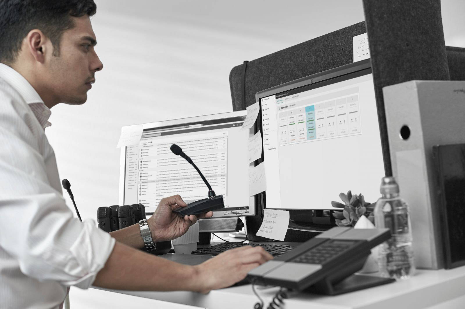
Users: Its target audience is enterprise AV/IT managers, and system integrators.
UX Goals: Revamp the UI, align with Design System, and upgrade overdue UX issues.
Challenges: Not enough users available to do usability testing; Strong dependency on existing backend structure; Different views need to be designed
Step 1 | Problem Analysis
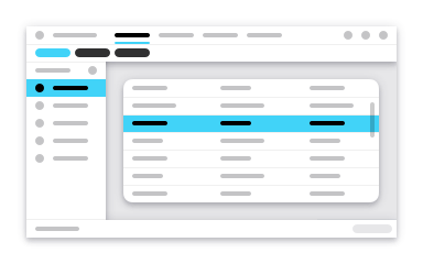
Existing Issues with the Old UI
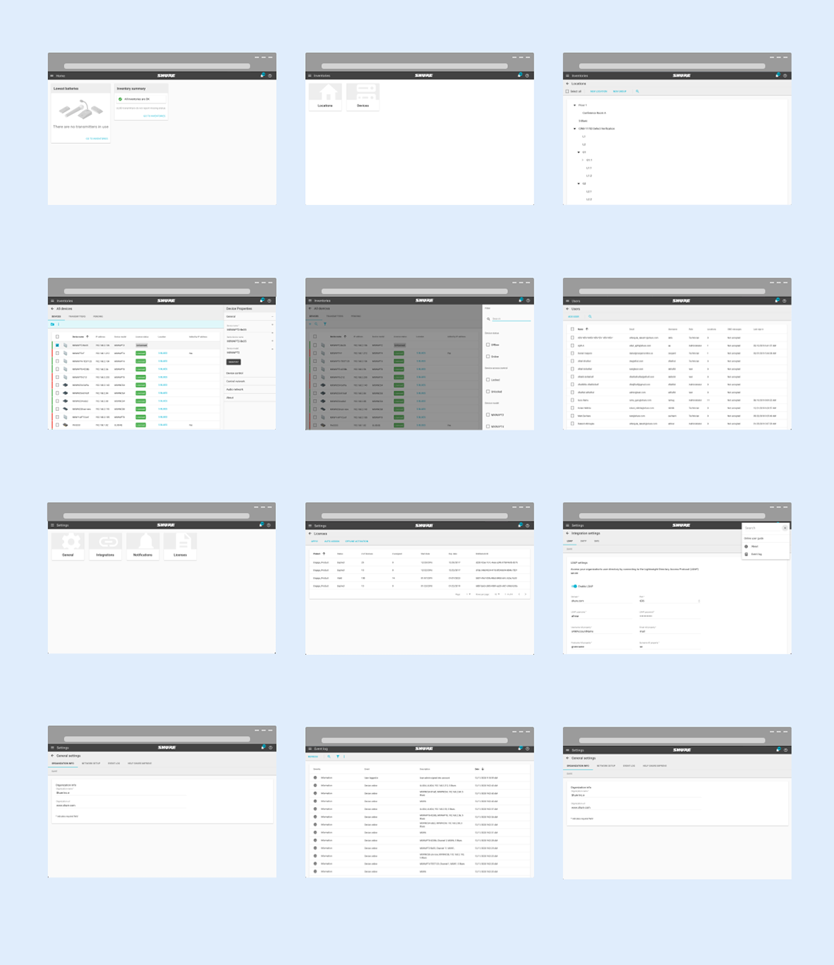
(Old UI examples)
The Old UI had multiple usability issues:
1. It uses outdated design patterns;
2. Has a ton of empty space, wasting the UI real estate;
3. Low contrast on the color pallet, bad for accessibility;
4. Lacks a clear focus point of the main workspace;
5. Hidden navigation lacks visibility;
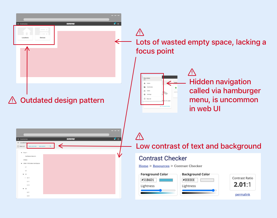
(Detail analysis of usability issues)
Solutions
1. Updated visual language with the new Design System;
2. Added an always presenting L shaped navigation panel;
3. Removed mixed use of mobile & web pattern;
4. Created a workspace to give a focus point of UI;
Step 2 | Plan + Sketching
Information Re-Architect
Using Information Architecture Analysis to break down the app features, then regroup to build a sitemap
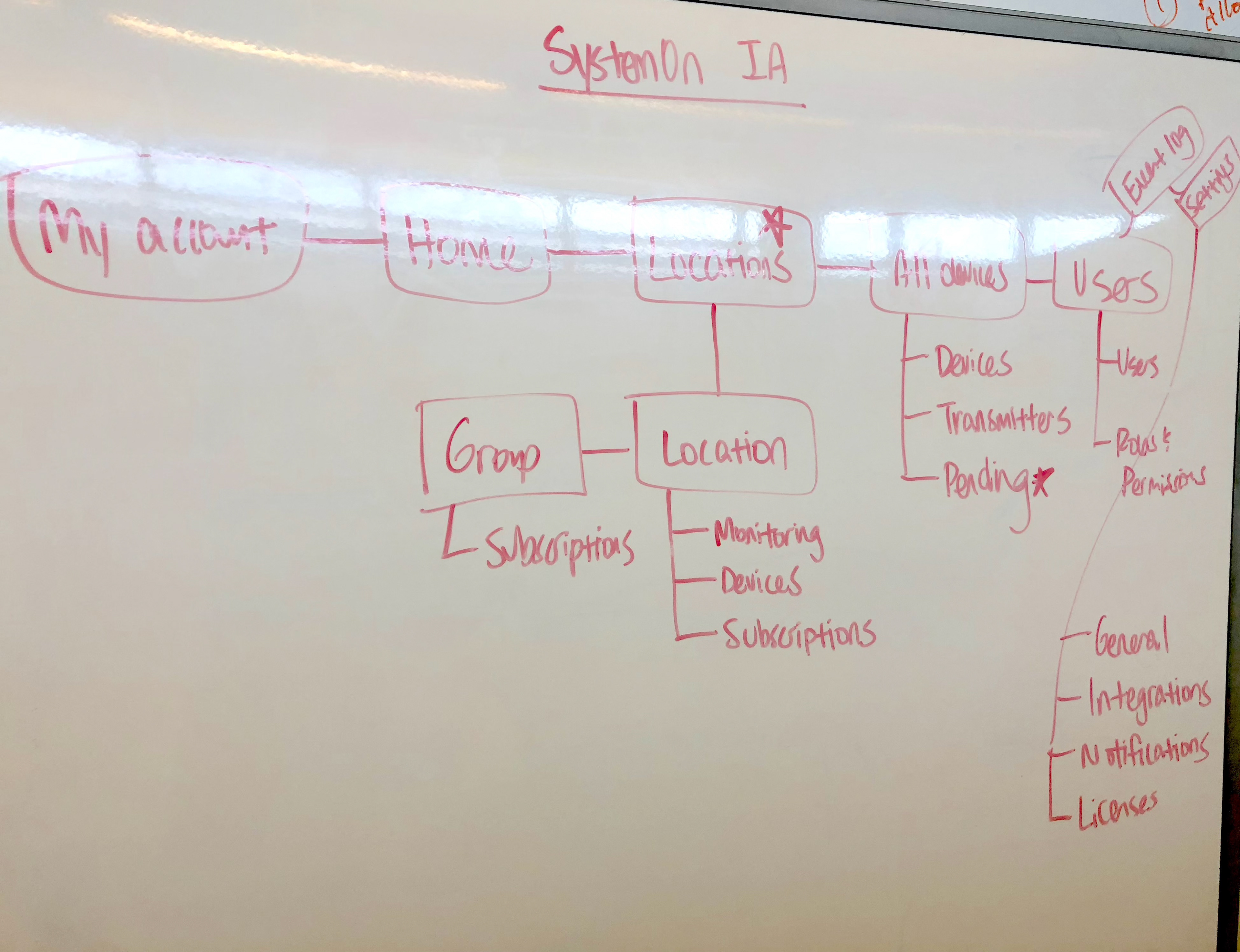
IA remap
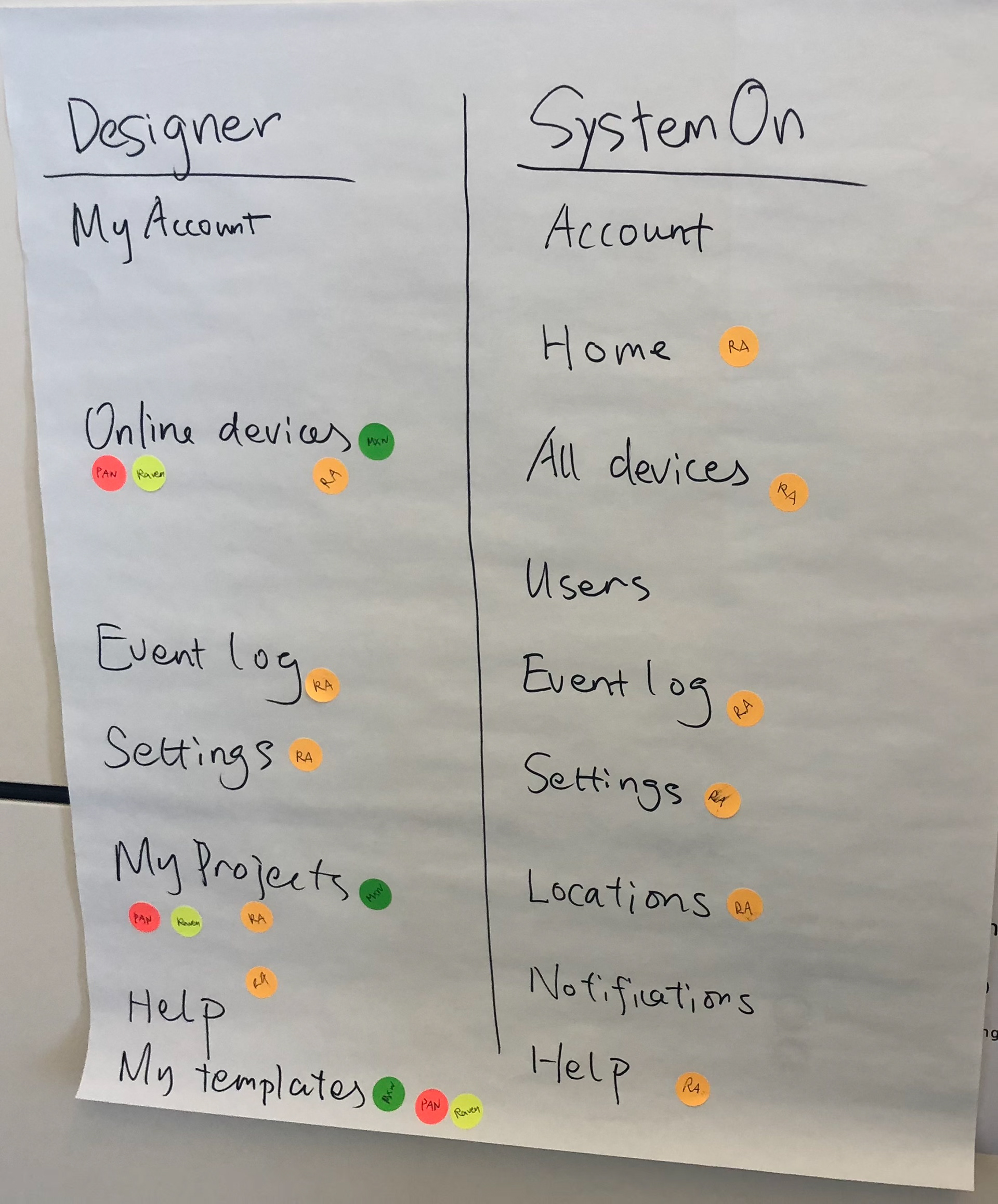
Feature blocks
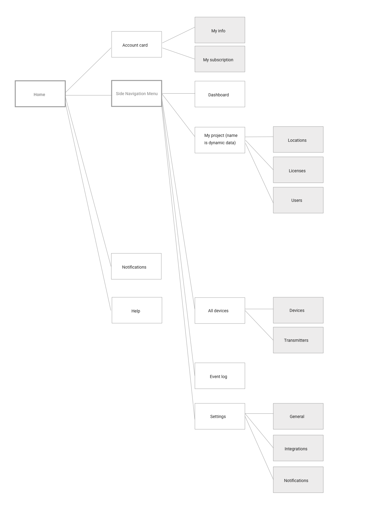
Sitemap
Step 3 | Design
Mid-Fi Design
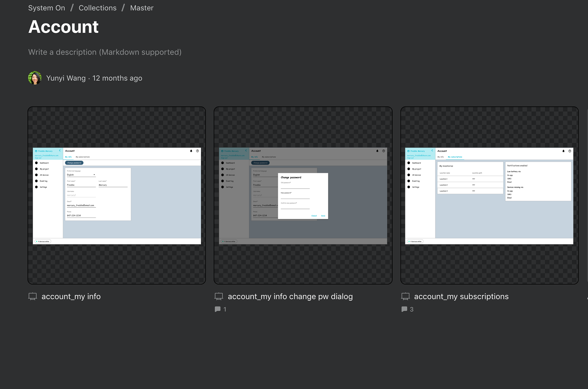
Branch_Account
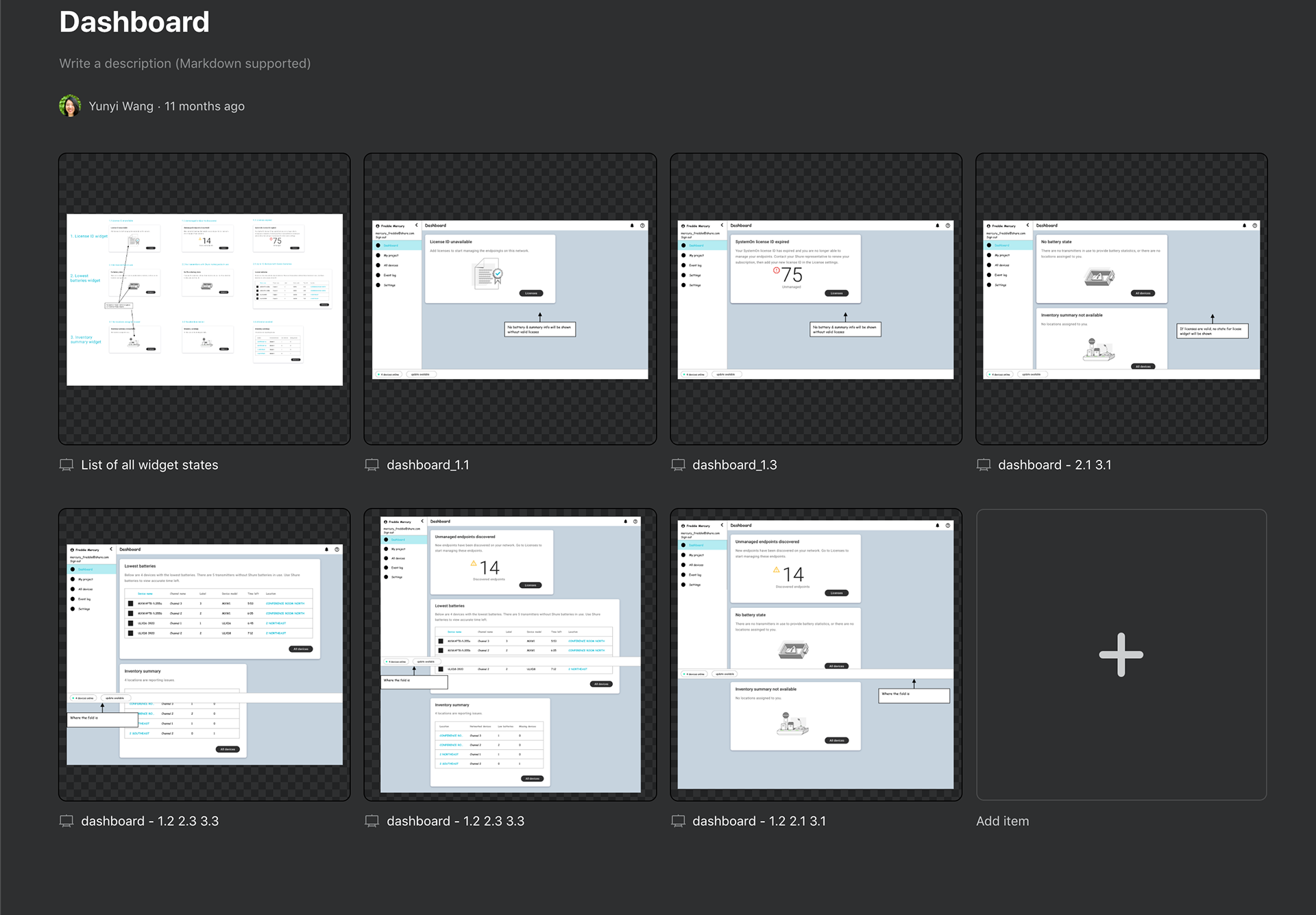
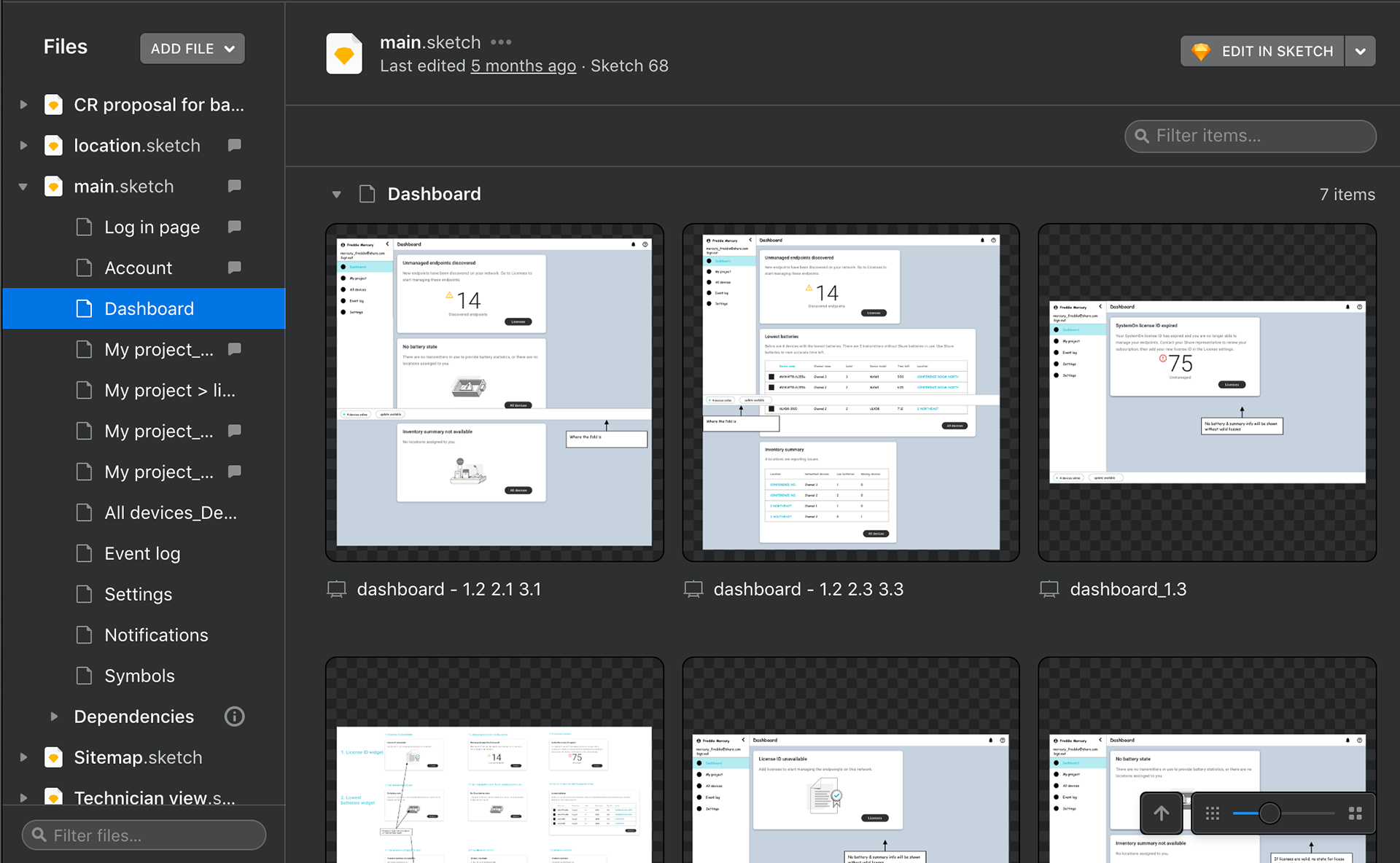
Branch_Dashboard
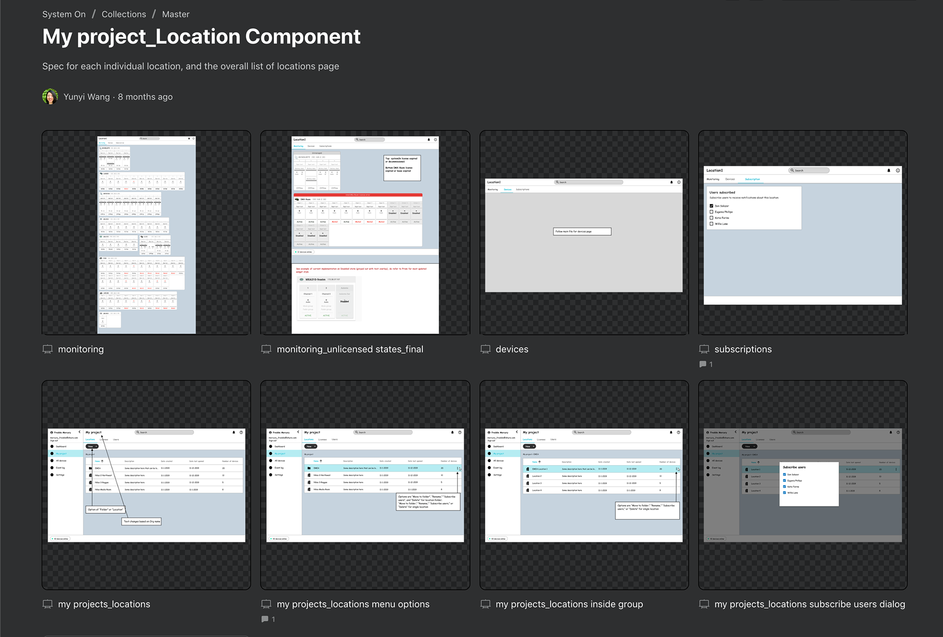
Branch_My project_Location
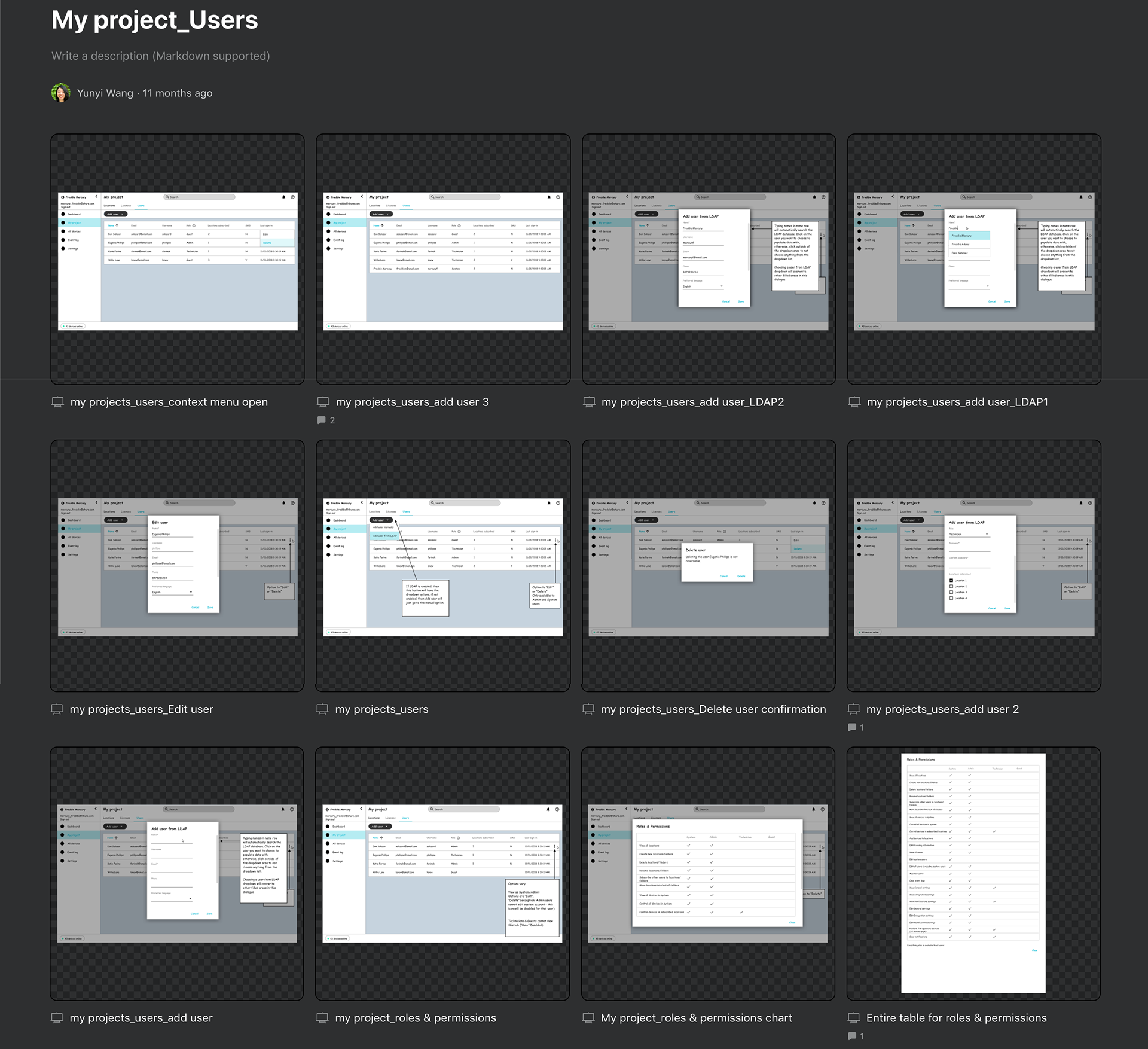
Branch_My project_Users
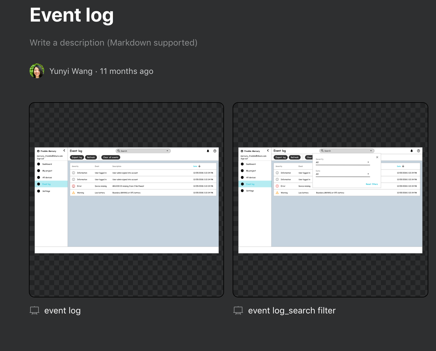
Branch_Event log
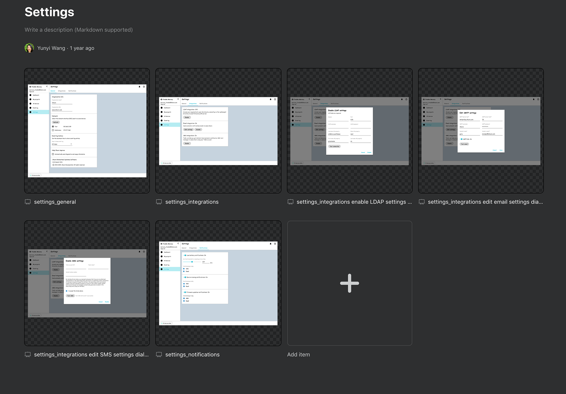
Branch_Settings
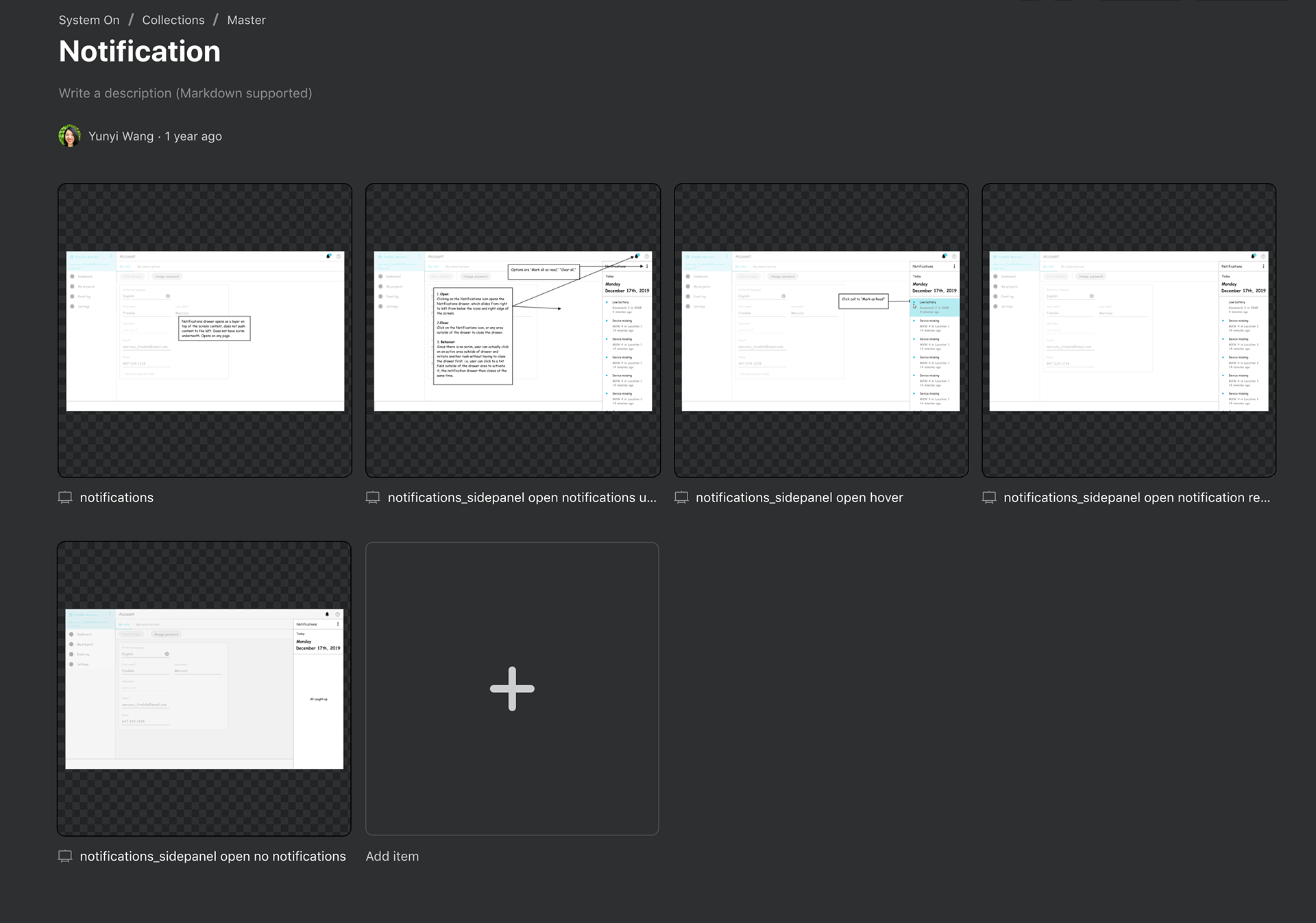
Branch_Notification
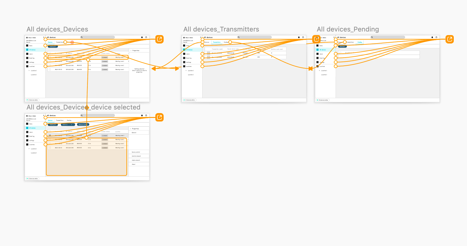
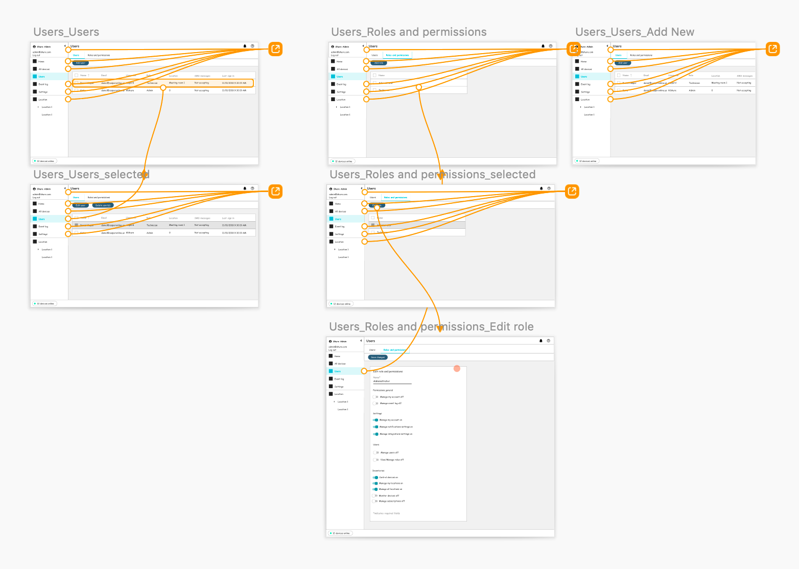
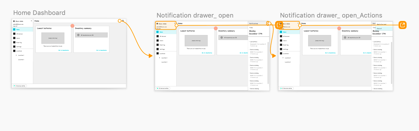
Hi-Fi UI Deliverables
The updated New UI has: A) a higher contrast; B) a better organized content layout; and C) follows most recent Material UI patterns
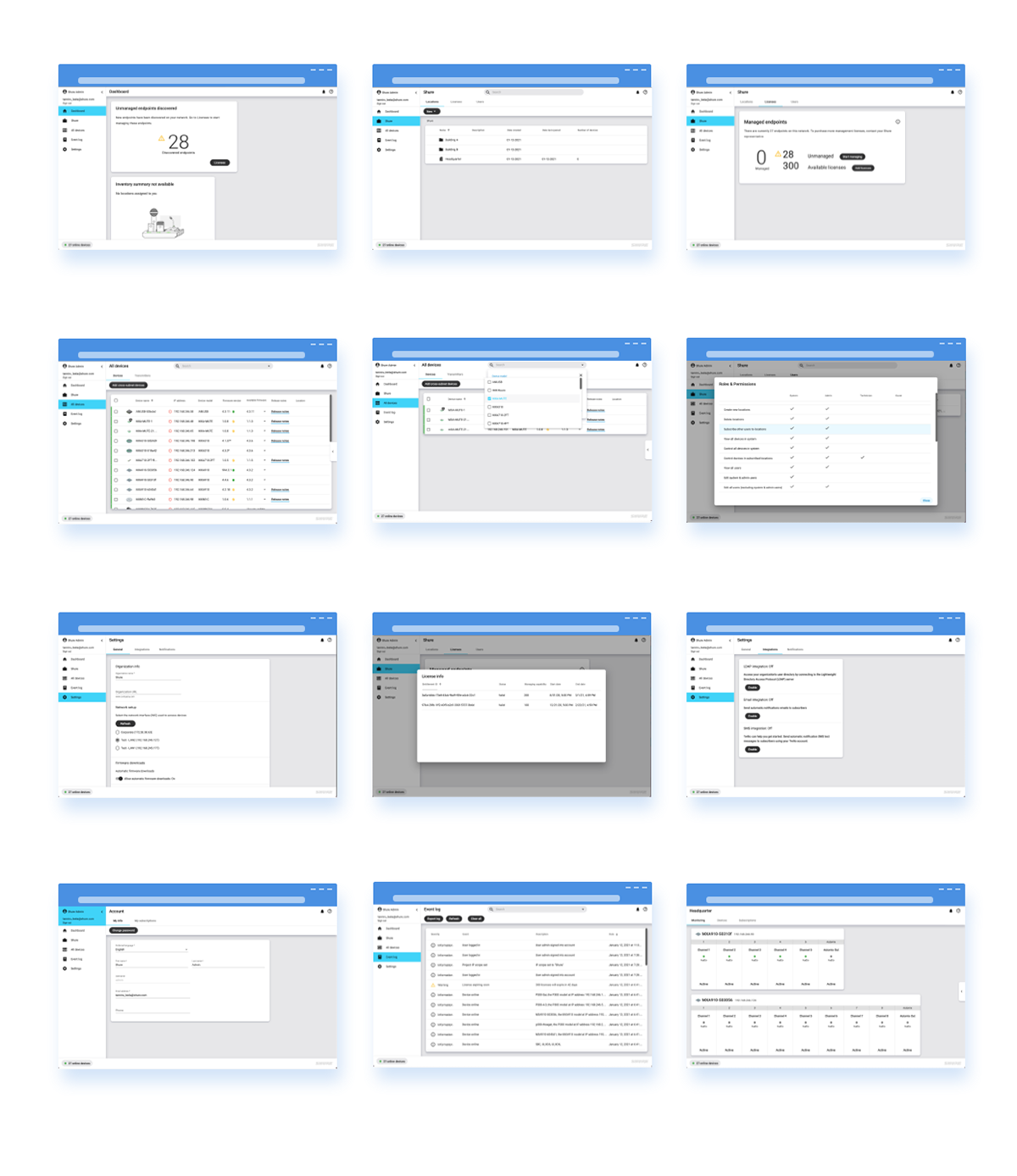
(Newly Released UI)
Retrospective
Biggest takeaway from this project is communication early on in the process with all team functions. As a designer, learning the technical challenges and enablers from work partners is just as important as designing itself. Via effective communications with team members, I understood why the application was designed this way before (and what technical constrains we used to have); and how we can tackle the legacy problems with new tools at hand to bring the biggest impact to our customers.